Tuesday, October 23, 2018

orange in quilts

"Fruity Beauty" 2015 by Bill Volckening, quilted by Jolene Knight
Historians looking at today's quilts 100 years from now will likely be struck by the amount of orange, but quiltmakers have had a long love affair with orange.

applique quilt, c. 1850, Mary Couchman Small, West Virginia

According to The Quilt Index Fabric Dating References, orange was popular in the middle to late 19th century and specific shades of orange can be good clues for dating quilts of the period.

"Chrome orange, or antimony, was commonly used in appliqué, especially in Pennsylvania, from about 1860 to 1880. Thus, this dye can help to both identify both the date and location in which a quilt was made."
1860s floral applique quilt with cheddar orange
"This dye was often made in the home from store-bought powder, however, the high lead content of the dye made it (in retrospect) a dangerous substance with which to work. While the color was called antimony or chrome orange in the nineteenth century, historians and collectors often call the color ‘cheddar’ today." - The Quilt Index.

sunburst cornerstone with "cheddar orange" from an 1860s pieced quilt
Pepper Cory wrote a wonderful article, "Cheddar Quilts" for Quilters Newsletter in 2014. An album quilt from my collection, made by Mary Couchman Small of West Virginia in the middle 19th century was included with the article, which is well worth tracking down if you're interested in reading more about orange in quilts.


Several of the most memorable quilts in my collection include the color orange in various shades. The interesting thing is orange is not really making a comeback. It never went away. 

Here are a few of favorites from my collection. 

late 19th or early 20th century pieced quilt
Victorian period quilt with orange and orangey-red
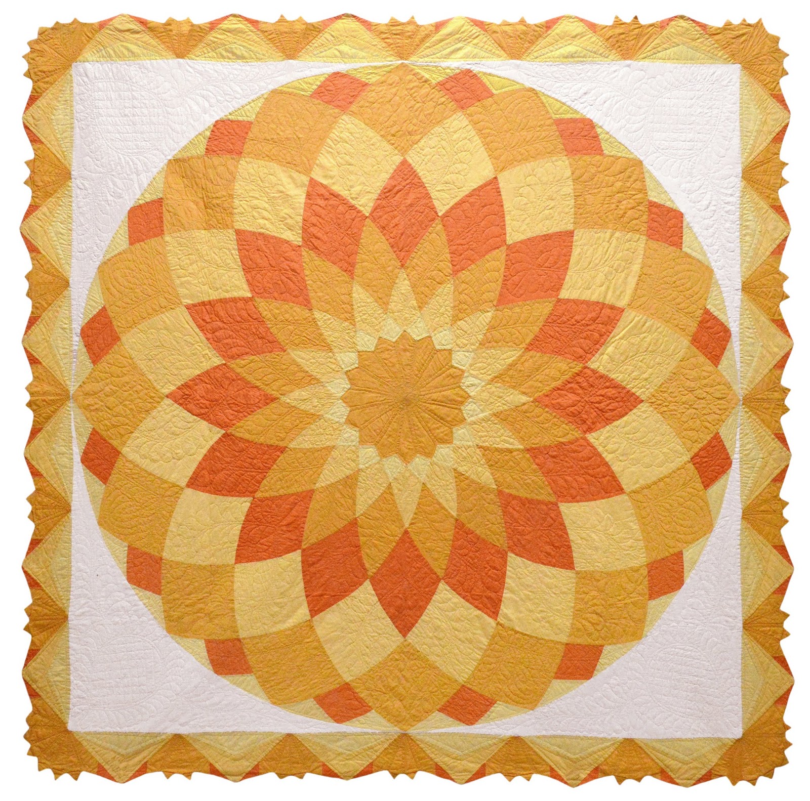
1930s "Giant Dahlia"
applique quilt from Hawaii, c. 1930
Mountain Mist "Jack 'O Lantern" quilt, c. 1935
1930s Mountain Mist "New York Beauty"
1970s polyester quilt with orange
1970s Hawaiian scrap quilt with hot orange and pink
Star quilt (2015) by Victoria Findlay Wolfe, quilted by Jolene Knight
Medallion (2014) made by officers of Portland Modern Quilt Guild

Turn and burn...


"Turn and burn" is an expression used by restaurant folks. You might hear it on a busy Saturday night when the servers are "turning and burning" their tables to seat as many consecutive parties as possible. The trick is to make the guests feel happy, satisfied, and not rushed at all.


Turn and burn was the plan for this quilt. It cost less than dinner for one at Sayler's Old Country Kitchen, so I was going to grab it and sell it right away. Then it arrived, I took its official portrait and changed my mind. It's a keeper.


I love the vibrant polyester double knit fabrics, the yellow ties and the mix of solid and pattern.


I especially love the bold, large design-- just two oversized blocks with wide, solid borders. The scale reminds me of some of the quilts I see being made today...modern quilts. Once again, everything old is new. I am happy I decided not to turn and burn this quilt. One day I may sell it, but I'm holding on to it for now.

Friday, October 19, 2018

My Favorite Things: Surface Texture


Almost 30 years ago when I first started collecting quilts, there was something strange about the pictures of historic quilts in print media. Most of the pictures appeared to show little or no surface texture.


I love seeing the surface texture created by quilting, but capturing it in a photo is a challenge. The photos I saw in publications looked like they were lit straight-on with studio strobe, which tends to flatten out the surface a lot.


In my first book, "New York Beauty, Quilts from the Volckening Collection" (Quiltmania/France), I spent a lot of time on photography. It took an entire month to shoot photos of the 70 quilts that appear in the book; roughly two hours each day shooting, and several hours editing.


The narrow window of shooting time was around the "golden hour" when light poured in to the studio and bounced off the walls in all directions. The natural light was perfect for capturing surface texture.


Recently I wrote an article for Quilting Arts Magazine, with information about how I photograph quilts and edit the photos. The article was in the August/September issue of the magazine. The only photo I didn't take was my portrait, taken by my fiancé, Linda.


In the article, I talk about my studio, and how I prefer to use daylight to show the surface texture of the quilts. Usually I set up and wait for the perfect light before taking photos.

I also took all the photos of the antique quilts in the new book, "Inspired Free-Motion Quilting: 90 Antique Designs Reinterpreted for Today's Quilter" co-authored by Mandy Leins (2018, C&T/Stash Books).


Since the book is about quilting, it was important to show the quilting and the surface texture in the antique quilts. Surface texture-- it's one of my favorite things!

Wednesday, October 17, 2018

Create Whimsy Interview


"Old quilts have information we do not find anywhere else."

Recently I did an interview with Create Whimsy, an online community celebrating creativity and the stories of makers. There is a related interview with Mandy Leins, co-author of our new book, "Inspired Free-Motion Quilting: 90 Antique Designs Reinterpreted for Today's Quilter" (2018, C&T/Stash Books). Many thanks to Create Whimsy for featuring us! To see Mandy's interview, click here. To see my interview, click here.

Monday, October 1, 2018

Intervista - ArteMorbida


Non parlo italiano, ma voglio ringraziare ArtMorbida Magazine per l'intervista. È stato bello passare un po 'di tempo a parlare della collezione e delle trapunte in America. Clicca qui per leggere l'intervista, in inglese o italiano.